Showing posts with label mixed media. Show all posts

Monday, June 10, 2013

It's Time for Index-Card-A-Day 2013!


Hello, June! You are my favorite month. The flowers and trees are finally blooming all over. My raspberry bushes are bending under the strain of so many hopeful buds. Warm nights smell of lilacs, roses, and neighborhood fire pits. In other words, summer finally makes it's late entrance here in the "frozen tundra" of Rochester, NY.


June means the beginning of the 2013 Index-Card-A-Day Challenge (ICAD3)! One index card a day for June and July = 61 cards! Everyone is welcome to join. If you're late starting, that's ok. Just start! 

Tammy at Daisy Yellow has (completely optional) prompts and weekly themes. If you're kind of stuck and don't know what to do, these can be a helpful push.

Join the flickr group and share your cards! Join the Facebook group, too! 

Hashtags & such: On twitter + instagram + tumblr + facebook use #icad. On flickr tag your artwork icad.

Link your blog posts here: http://daisyyellowart.com/icad/icad-faq.html

{be creative everyday} JUNE 1
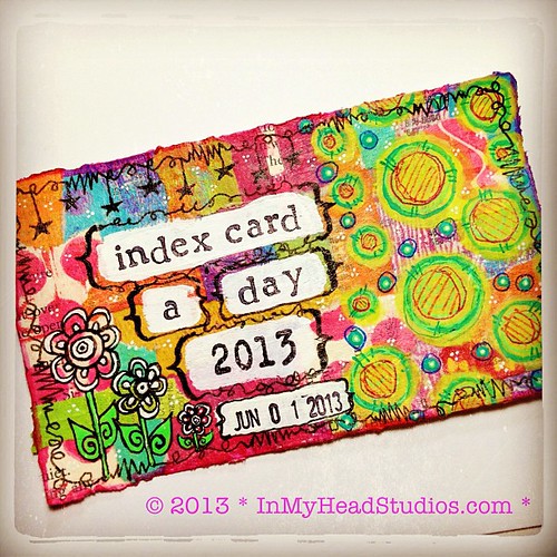
ICAD3 - JUNE 1, 2013
Painty phone book page collage background, acrylic paint, gel pens, Pitt pens, stamps, soft gel medium (semi-gloss). 
So here is my first card! The background is a collage of painty phone book pages that I use to clean off my brayer when printing. Ooohh, all the juicy colors left behind! It seemed a waste to, well, waste them. Details were added with gel pens and Pitt pens. 

I got lucky with my estimate of how long I needed to paint the white stripes to allow for the stamping of the words. Thanks, Muse!

I truly hope you decide to join in the fun. No pressure on all 61 cards. I had a blast doing this last year and I didn't make all 61. The world did not end. :)

Now shut off the computer and make some index cards!

- Vickie


Friday, March 29, 2013

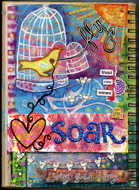
"Soar & Fly" Art Journal Page


"Soar & Fly" ArtJournal Page : Before

From this ...

"Soar & Fly" Art Journal Page : Before 2

... to this ...

"Soar & Fly" Art Journal Page : Full

... to this! Ta da!

This page had more planned for me than I did for it! My muse was here in my presence. I could hear her whispering to me to "let my Little Bird fly". 

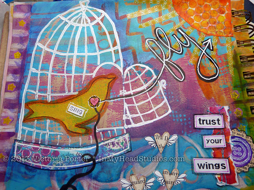
"Soar & Fly" Art Journal Page : Bird Cage

Fly, Little Bird. 
Fly and soar. 
Trust your wings. 
Sing your song! 
Your amazing tiny heart 
will take you anywhere.

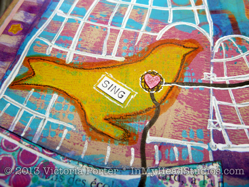
"Soar & Fly" Art Journal Page : Bird

This bird stamp is my design, and is made from foam sheet and cardboard. It is outlined in orange Copic marker and then black Stabilo pencil for dimension. The bird cage is white-out pen. I drew over that with a sparkly gel pen to make the bars look shiny and metal. 

"Soar & Fly" Art Journal Page : Trust Your Wings

The purple circle and scalloped dictionary page were scraps laying around. I added my handmade button stamp to the circle and layered them. I used my label maker to print the words because I was in a hurry. They are pixelated, and that bugs me, but it's not a deal-killer on this piece. 

"Soar & Fly" Art Journal Page : Soar

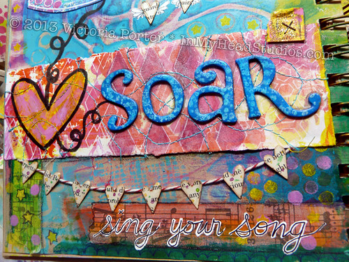
The letters for "soar" were brown to start with. I painted them and stamped some dots and lettering on them with paint. The dimension the raised letters add is lovely! 

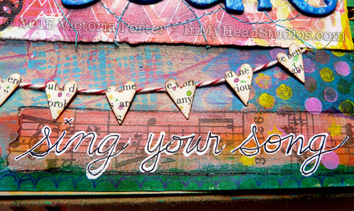
The little heart banner is punched hearts from book pages and baker's twine. A little watercolor splashed on the hearts creates some interest. 

"Soar & Fly" Art Journal Page : Stitching

Look! I managed to sew in curvy lines - not jagged straight-ish arcs! The paper itself is created with gelli plate printing and white gel pen. This is before I drew the heart and swirly black line.

"Soar & Fly" Art Journal Page : Banners

To connect the theme of singing I glued down some tissue tape with music on it. That needed some color so I washed a little acrylic paint over the tape. Using a Molotow white paint pen I wrote the words "sing your song" and added black to make it more readable. Some little doodles and stars here and there finished the piece nicely. 

There you have it! This is the first art journal page I have completed this year. It took several days to work out. I printed the background about a month ago with my gelli plate right into the journal. 

I worked on it here and there for a while until the full image finally came together. I wanted to experiment with some ideas I had in my sketchbook, and this piece gave me the chance to work those ideas out more thoroughly. That's what I love about art journaling! Mad science experiments! Focusing on the process! Mastering techniques! Practice  Practice. Practice!! 

I hope you have a wonderful weekend! Happy Easter if you celebrate! Also, Mr. M turns 40 this weekend! Huzzah!
- Vickie

Wednesday, March 13, 2013

"Summer Evening" Gelli Print


Since my Artist Spotlight post went up at Gelli Arts' Facebook page I've had some inquiries into how I've created some of these prints. Several people had questions regarding the vibrancy of my prints. How do I do it?

To be honest, I'm not completely sure. I really had to go back and almost dissect my work to produce an answer. 

Right now my best "guess" is using color theory to not layer colors over each other that produce muddiness (like putting a bright yellow over a purple because red + blue + yellow = mud). 

I use rather bright paint colors to begin with. As with any kind of paint the colors vary in opacity and translucency. Knowing your paint helps a lot. 

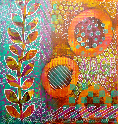
Let's take a look at my "Summer Evening" gelli monoprint.

I will freely admit much of this print is a happy accident. This piece was very experimental from the start except for the leafy vine stencil I cut freehand. 
"Summer Evening" Gelli Monoprint

The first layer of paint is a dark cranberry purple -  Yes, I know I just ignored the suggestion above about putting those colors in a bottom layer. Experimental, remember? 

The large circles, when wiped out with my finger and a paper towel, looked really nice with how organic the edges became when printed. 

I added a little fuchsia over that cranberry purple. You can see in the wiped out circles the little lines and squares of fuchsia. 

"Summer Evening" Gelli Monoprint 3

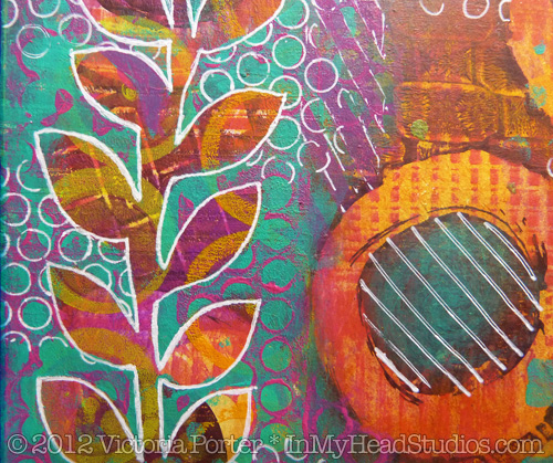
I wanted a lot of color and layers under the vine to create a lot of dimension. Intending to just print on the left side under where I planned to put the vine stencil, I inked up my gelli plate with yellow. While printing the left side of the piece, the right edge of the paper fell out of my hand and into the yellow paint. EEEK!

Mud! Instant muddy brown. What to do?! Grab a baby wipe!

I figured there was enough paint on the paper already that it would hold up to a wet wipe down. When I wiped away the yellow paint it left this glowing, bright yellow orange behind. The fuchsia and yellow created this color in the white space of the wiped out circles. So basically this side of the print received a yellow color wash. Nice happy accident! 

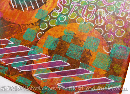
Incidentally, you can see how awful that yellow muddied things up if you look in the upper right corner of the piece. There is some of that yellow that I didn't wipe off. (I suppose if I wasn't going for bright colors and wanted brown I would have been satisfied with that yellow.)
"Summer Evening" Gelli Monoprint 2

I printed a thick layer of turquoise while masking out the vine with my hand cut stencil. Then I used a handmade stamp over that with more fuchsia. Several more handmade stamps, some stenciling with punchinella, and some white gel pen brought the piece together.

Ta da!
"Summer Evening" Gelli Monoprint 4

Working on this piece got my brain wondering how color washes over prints would look. I added Distress Stains over some parts of other prints, and it looks really cool. Adds a pop the piece didn't have before. I also seem to have a thing against white space. I love full blown color all over. I made some prints on paper I covered completely in Distress Stains and watercolor. 

Color washing first also helps me avoid the "white blank page" staring contest. It's already started! All I'm doing is adding to it, I tell myself reassuringly. 

I would love to share in the joy of your happy accidents! Link up to your posts about them in the comments, please!


- Vickie

Monday, March 11, 2013

{be creative everyday: 2013} MARCH 8


Gelli Print Collage - work in progress

paper collage of acrylic monoprints, gel pen, ink, handmade stamps
5.5" x 4.25"
© 2013 Victoria Porter


This isn't quite the finished version. I added a little more detail to it after I took this photo with my phone. 

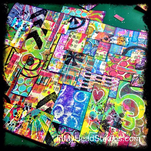
All of these pieces of paper were printed on my gelli plate. Some were already printed with text, like the Japanese newspaper I picked up on a visit to Austin, Texas, and some dictionary pages. Using my hand-carved stamps and black archival ink, I stamped some designs on some of the pieces.  

I'm deciding whether or not to send it through my sewing machine for some random stitching. It feels disparate to me and needs some cohesion. 

What do you think? Stitching or not?

Happy Monday!

- Vickie

Thursday, February 14, 2013

With Love From Friends! 2013


Card for With Love From Friends (1)

Happy Valentine's Day!!!

For the past three years I have been delighted to volunteer for With Love From Friends (WLFF) by making Valentine's Day cards for people who are without family or friends to remember them. 

The fabulous Eve Elzenga developed and coordinates this project. WLFF is such a wonderful program. I adore Eve and her work. I'm not alone... Eve was the recipient of a Jefferson Award in 2011 for her public service for WLFF! 

Eve strives to have high quality cards made with great materials and by artists in our community. She really wants the cards to be well made as the people who get them really do cherish them and deserve nice cards created by adults for adults. In years passed she opened her home for all of January so people could come over and make cards. Her collection of high quality supplies, papers  embellishments, ribbons, and little gorgeous what-nots were made available to artists to pick up and use this year. She collects Valentine art supplies all year round. 

As someone who has been lucky enough to spend a lot of time with my grandparents and great grandparents, I appreciate and value my elders. Now that they are gone, as well as my beloved father - who will always be my first Valentine - I felt like their memory needed to be honored, especially on a day all about love. So in memory of my loved ones passed, I made ten cards for With Love From Friends

Card for With Love From Friends (2)
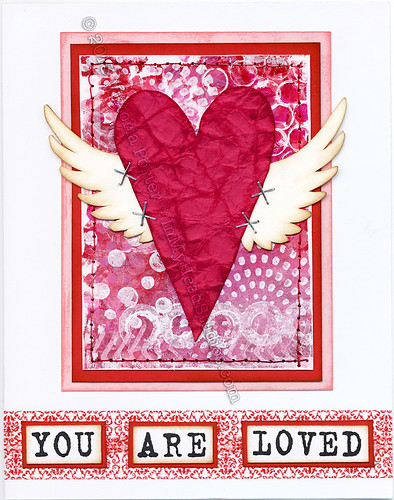
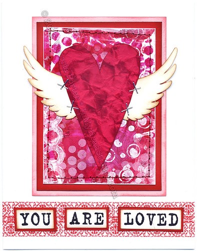
"You Are Loved"
acrylic monoprint, paper, mixed media
4.25" x 5.5"
© 2013 Victoria Porter
My cards started as Artist Trading Card sized (2.5" x 3.5") original monoprints made on my Gelli Plate. I added red and pink cardstock mats behind and stitched them together. The heart is crumbled red cardstock inked to add some dimension. Don't you love the tiny staples?! Everything but the straight lines on the mats behind the monoprint are all hand cut by me. The words are all hand stamped. The wings are my design and took a long time to cut out. (I do not even own a die cutting machine. I do it old school!)

Each card I made is a one-of-a-kind piece of artwork as all of the monoprinted backgrounds are different. 

Every card donated to WLFF is stamped with "With Love From Friends" on the inside. Did someone say 1500 cards need to be stamped?!?!?! I am so on that. My mother and I spent many hours stamping the inside of cards last week. We had a ball hanging out with Eve and her partner! 

This year WLFF is in need of a Sizzix Big Shot Die Cutting Machine, Valentine themed cutting dies, and cash gifts so they can update their website. Supporting Eve in her efforts pays off in ways you can't even imagine. Hop on over to WLFF and see how you can help for next year! 


- Vickie

Friday, July 13, 2012

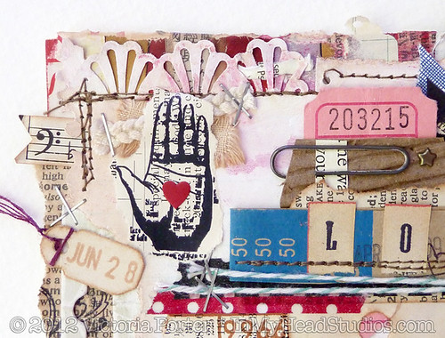
LOVE: Index-Card-A-Day 2012: 6/28/12


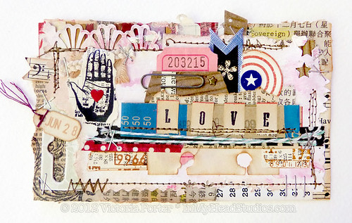
"LOVE" : #icad2 for 6/28/12 :: 2

For so long I have been blown away by some scrapbook pages - the kind with the sort of minimalist use of space with a lot of design and embellishment in one area around the photo. Particularly the work of Finnabair makes my brain pop. It's amazing, and I would love to speak to this artist about her work. 

After several attempts at this type of collage, I had kind of given up on getting it how I wanted. But I am not one to give up that easily. So I studied her work and the work of her peers. I studied the composition, layers, and colors. I deconstructed the pieces in my head and put them back together.

Of course this made for a good Index-Card-A-Day 2012 challenge. I'm trying NEW things for #icad2 and using up supplies I haven't even touched or have been saving forever. Time to open the scrap box...

"LOVE" : #icad2 for 6/28/12

... and pull everything out but the kitchen sink! Here we have random book pages, tickets, a cardboard coffee sleeve, tags, baker's twine, staples, stars, old paper from books and ledgers, sheet music, a paper clip, envelopes, a money band, washi tape, canvas, embroidery trim, a star brad, hangtag packaging, and stitching. 

"LOVE" : #icad2 for 6/28/12 :: 3

I literally spent hours and hours fiddling, and that turned into about three days of pushing bits and bobs around to get this done. I simply had to walk away from it several times to clear my head. At one point, all of it finally "clicked into place" - the layers, the arrangement, colors, and textures. 

"LOVE" : #icad2 for 6/28/12 :: 4

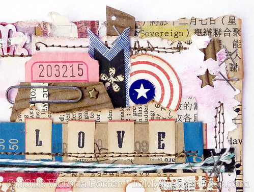
A lot of this was experimentation. Not knowing where I'm going with something can be very freeing to me. I asked things of my paper punches that only a mad scientist would try. I added some collage. Then went to the sewing machine. Then to the paint, and on and on until basically I made a tour of my studio in supplies and paper ephemera. 

My goal was to use these things in an "as is" condition as much as possible. I love how the ledger paper holes look as a design element. The letters for "LOVE" are stamped on the edge of a vintage dictionary page; I wanted to preserve the red edges as well as take advantage of the natural patina of the old paper.  

"LOVE" : #icad2 for 6/28/12 :: 5

I'm happy with the result. Even more though, I am happy that I TRIED this. Even if it had turned out to be a total FAIL, I still faced the edges of my comfort zone with courage and smashed those barriers to smithereens. I cannot recommend anything more highly than getting off your duff and doing that thing which scares you most in your art. 

Just. Do. It.

It's just paper, after all. Right? 

Right.  

- Vickie

Tuesday, July 3, 2012

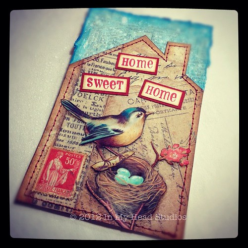
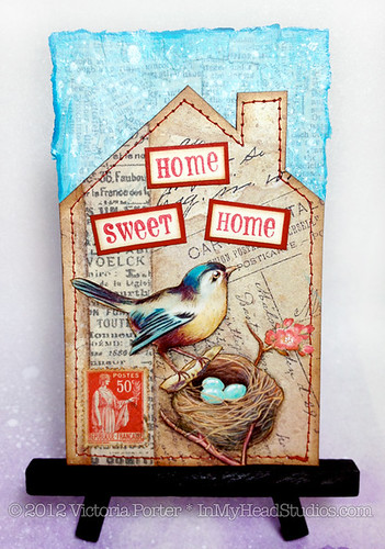
"Home Sweet Home" ICAD2 for 6/21/12


home sweet home :: #icad2 6/21/12

Ok, I might be making the Index-Card-A-Day Challenge a little more challenging than I hoped and/or planned. I've just been so inspired! I didn't realize my brain needed a little discipline to work on something everyday, and now I am hungry, hungry, hungry for art all the time. I LOVE this!

This card is from June 21, 2012. It definitely took me more than one day to do this. I'm not getting a card a day done -  and I gave myself permission to do that at the start. However, I do believe I am still benefitting from this challenge like crazy. If I'm not getting one card a day done then I am at least working on one (or two or three at a time) each day. AND THAT COUNTS.


"home sweet home" ICAD2 :: Words

This house, bird, and nest image is something I've worked on before in different formats - for domino pendants and ATCs. Now I felt it needed an ICAD2 work-up. 

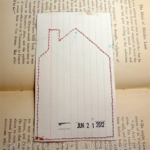
I started by making a house shaped template that fit the index card. I cut the house out of another index card, pasted scrapbook paper over it, and added the tissue tape. Then I stitched around the edges on my sewing machine.  

The sky is layered torn dictionary pages secured with matte medium. I added some watered down blue paint then splattered really watery gesso over it. I left the torn edges because they reminded me of deckled edges on handmade paper. The edge was then shaded with a darker blue Copic marker. 

The lettering is hand stamped in red pigment ink - which I had to stamp a billion times because I always mess up the last letter and ruin it. It's matted with dark red cardstock. The edges are inked to "age" and soften them. 


"home sweet home" ICAD2 :: Bird

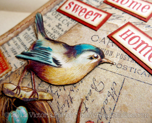
The bird and nest images are from flickr's collage images group. I love the detail and texture in these pieces. My printer went light on the ink for this printing - not sure why. I went back over the pictures with colored pencils to bring out the color more. The gleaming highlight in the bird's eye is a dot of white gel pen. I also highlighted the eggs with white gel pen. 


"home sweet home" ICAD2 :: Nest

After I adhered the bird and nest to the background it all looked very flat. I used colored pencils to shade around the bird and nest for some dimension. It really perked the piece up. I also ran a thin line of dark brown pencil to the very edges of the paper of the collage images to bring them out more. 


"home sweet home" ICAD2 :: Postage Stamp

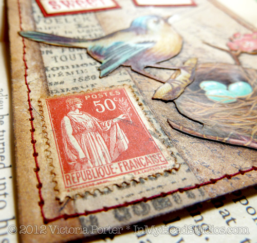
Oh, how I love using foreign postage stamps in my collage! I have about 20 pounds of old stamps (anyone need any?). I chose this one for the color and the country of origin - France - so it would tie in with the tissue tape behind it that has French on it.  


"home sweet home" ICAD2 :: Back

The back of the index card has the stitching I did with my sewing machine. I love sewing on paper. I'm stamping the date the card is finished on the back. I should go back and add some more details to the information of the piece. 


"home sweet home" ICAD2 for 6/21/12
"home sweet home" Index-Card-A-Day2
Mixed media & paper collage on index card
3"x 5"
© 2012 Victoria Porter/In My Head Studios
This ICAD2 looks adorable on a tiny easel I found at the craft store! 

I am a bit behind on posting more ICADs that I have finished. There's much more to come!

- Vickie
Sunday, June 17, 2012

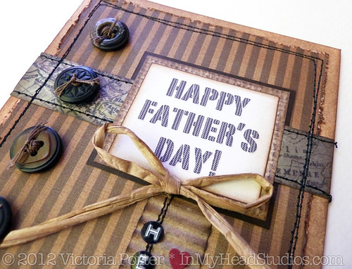
Happy Father's Day : A Card


We are so blessed to have Mr. M's father in our lives. Father's Day has been hard these past two years since I lost my dad. But Mr. M's dad is such a wonderful guy that I'm grateful for the opportunity to celebrate him! 

Father's Day Card :: from Instagram

Most of the time when I start working on something I really don't have the "Finished Piece" visualized in my head. There may be parts of it or just a color scheme to begin with. For this card I was reaching toward handsome and manly. Mr. M's dad is an outdoorsman and enjoys fishing. So I went with earthy tones and unusual textures. 

I started with a blank piece of ivory cardstock, cut it in half, and folded it to make the card part. Using a foam blending tool I inked the edges of the card with some brown inks. Using two shades adds a lot of dimension and is worth taking the little bit of extra time to do so. 

Next up was my choice of papers. Pretty much went all out brown on this one. Using that large of an area of bold vertical stripes was stepping out of my comfort zone. I like swirly backgrounds. But for a guy simple and stylish is the way to go. I distressed the edges heavily. Even tore some off to make it look really tattered. Then I inked the distressed edges to, once again, add more dimension. 

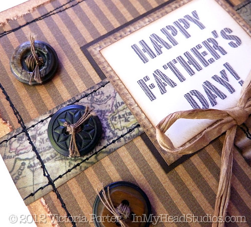
At this point a plan does need to begin forming. I pulled out a couple scraps of paper and moved them around the face of the card until it looked pleasing, and I could decide where I was going. Eventually I chose a strip of map paper, a dark brown cardstock, paper that looks like burlap, and the sentiment printed from my computer that I designed in a font that looks like tire treads meets tweed meets stenciled lettering. How manly is that?!

Father's Day Card :: Sentiment Detail

I wanted a layered look so I put the strip of map paper between the two mats for the sentiment. That helps tie the elements together. 

When deciding to use my sewing machine on cards I find that if I don't really have a solid plan from here I mess the stitching up. Or sew the card itself shut. (Come on. Don't act like that never happened to you.) 

First I adhered the map strip to the dark brown cardstock with the dark brown behind the map paper. Then I adhered that to the card. Time for the sewing machine! 

Sewing Mr. M's dad's Father's Day card.

I stitched all the way around the card twice and then ran border stitches along the map strip edges. On cards like this where distress is good neatness doesn't count. I wobble the line a bit. It's more interesting. 

I glued the sentiment to the burlap paper and then glued that down over the map strip and stitching. See how planning ahead on the stitching prevented me from sewing through the sentiment? :) 

(Can you tell I'm not a seamstress? 99% of the material put through my sewing machine is paper. I think the only fabric I stitched was my craft show tablecloth hem.)

Father's Day Card :: Button & Map Strip Detail

I love using buttons on cards, and for guys it's especially appropriate. I chose an assortment of brown buttons from my extensive stash. Whenever I use buttons I pretty much always add thread through the holes so it looks like it is stitched to the card. Buttons on my cards without thread look "unfinished" to me. Again since I was going for a distressed look neatness didn't count and I left some straggly threads hanging on. 

I adhered the buttons to the card using Glossy Accents. I did so because it is wicked strong at holding 3D embellishments, and it dries quickly. Regular white craft glue would take hours to dry in that situation. This took 15 minutes. Joy! 

I thought at this point I might be done, but there was this big blankness in the bottom right corner. It looked unbalanced. I had to come up with something to put there. Digging through the piles of paper options on my messy work table I came across a coffee shop cardboard cup sleeve that had been striped down to the corrugated inside part. Texture! And brown! Perfect!

Father's Day Card :: Hero Flag Detail

I'm in love with bunting and banners of any sort right now. I thought this corrugate would make a cute flag. I trimmed it down to size and clipped the end to make points. The edges were inked in a dark brown and a little black. A tiny voice in my head wondered what this would do if I ran it through the sewing machine. Hmmmmm. Tiny Voice, you may have a good idea! 

I tested it on a small bit of scrap corrugate. The heavy flattening power of the sewing machine foot smushed the wavy texture down. But it was usable by bending it back into shape. Then I stitched the one for the card. 

The card still didn't seem finished at this point yet. Hmmmmm. What to do? What to do? 

DYMO! A solid go-to when stuck! I punched out the word "hero" and then used a regular 1/4" hole punch to pop out the letters so they would fit my flag. I glued them on lined up with the stitching. 

I have a thing for using odd numbers of items in my design. "Hero" is four letters. Gah! It had to be balanced out so I added the three hearts. Ahhh. My OCD is calmed.

Father's Day Card :: Bow Detail

The spot where the flag met the seintiment mats looked stark. Another solid go-to for masculine cards is raffia. It's a good, natural material to get away with making a bow not look too foofoo. And, yes, I did ink the raffia a bit to make it look old. Once again, the Glossy Accents is the glue to use for sticking raffia bows to cards.

I'm wishing ALL the daddies out there a very Happy Father's Day!! I don't care how tough and gruff you are. If a two year-old hands you a toy phone, you answer it! :) xoxo

For the rest of you, have a shiny, sparkle filled Sunday!

- Vickie
Thursday, June 14, 2012

Shopping Trip: Index-Card-A-Day 2012


Yesterday's #icad2: using stuff I got on shopping trip with Mom that day!

My Index-Card-A-Day 2012 for June 11th, chronicles my shopping trip to the craft store with my beloved mom. 

I really just needed ONE white gel pen after mine went missing. So that was the plan when we went into the craft store. I employed the no cart or basket "if I can't carry it in my arms to the checkout then I don't need it" tactic. Otherwise I spend way too much on all the lovely goodies there. I was also hoping to find some embellishments for my travel journal - but not too many. 

I thought my index card for that day should be made with just the supplies I bought that day. I got some Tim Holtz tissue tape, alpha-cards and vial labels, Smash tape, K&Co borders (the tickets), and two white gel pens. The only things on here not purchased that day are the black paper, alpha stamps for the date, ink, and the adhesives used. 

The only white gel pen that's ever worked for me is the Sakura Gelly Roll. I know others swear by the Inkssentials and/or the Uni-ball Signo. Those just frustrate me by not laying down ink and have to be reworked more than I care for.  

The "M" card stands for my mom and the store name Michael's. I tried using most of the lime green part of the tape to tell the story that Mom wore a bright lime green shirt and - as always - matching bright lime green flip flops. That woman owns a pair of matching flip flops for every color shirt she owns, which is on the loooong list of things I love about my mom. 

Also, she actually said "I don't want to hear you lament the loss of your favorite white pen all week. Let's go get one."

She totally GETS me. <3

- Vickie

Thursday, February 2, 2012

What's On My Work Table: Wednesday


Hey kids, what time is it?! It's time for "What's On My Workdesk Wednesday"! AKA "What's On My Art Table Wednesday"! It's so fabulous it has two names!

Workdesk. Art table. Tomato. Tomahto. 

Actually the posts I started doing (and apparently stopped) were called "What's On My Art Table Wednesday?". Today it's changed because I want to participate in "What's On Your Workdesk Wednesday" (WOYWW) over at the Stamping Ground blog.

What's On My Work Desk: Wednesday 2/1/12

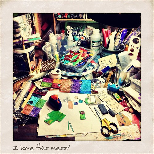
I took this photograph yesterday when what was in front of me while art-ing struck me as such a beautiful colorful mess. And I love those kinds of messes! 

The colored bits of paper are all painted by me for use in my mixed media collage. This photo shows quite a lot of the various media I like to use. I use paint, markers, paper, inks, stamps that I make myself, fiber, ribbons, watercolors, stencils - both homemade and purchased, gel mediums, and paper punches to name a few. 

The piece I am currently working on is that tiny oblong rectangle of green next to my yellow striped scissors. That is the size of my original collages for my line of domino pendants. Tiny. 

This photo was taken with my iPhone 4S, with which am I madly in love. The resolution is much better than previous models. Mixed with fun photography and editing apps it's a handy artists' workhorse. This was photographed with Camera+ and then edited in Instagram. You can find me on Instagram by the name of HeyVickie

Thanks for dropping by to my studio "virtually". I'd have you over personally but this place is a mess! 

- Vickie

I'm not being paid by anybody for any of this. Just sayin'.  

Wednesday, August 31, 2011

"What's On My Art Table?" Wednesday


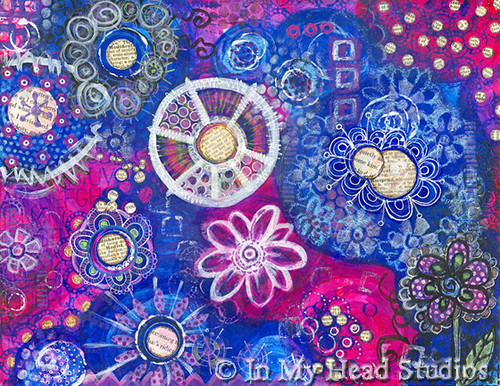
Blue & Magenta Circles :: Full

This page began as part of a workshop assignment to paint circles and then doodle over them. I am still working through Traci Bautista’s workshop called {31} daily inspirations. Yeah, that class I signed up for in early 2011. I’m really just now getting around to it.

I started with a white piece of 8.5” x 11” cardstock. Several thick layers of gesso were added to bring in a little texture to the paper and to seal it.

I acquired a new tube of paint I wanted to try called quinacridone magenta (Golden heavy body acrylic). When I opened the tube and saw how lovely it was I knew the perfect color combo would be phthalo blue, a hint of desert turquoise craft paint, and a little white.

The plan was to paint some loose circles and keep it simple. I was making a simple page to cut up to use for other collage work.

Uh. Yeah. Got a little off track there.

I saw the bigger circles had smaller circles in them. So I started working them individually thinking, “Ok, I’ll just cut this up in sections now for use on domino pendants and other smaller collages.” No problem. I have done that before.

So I began to think of the page as sections I was going to disassemble. They were not related to each other on the page. Just conserving paper by doing this prep work on one sheet.

But then it started to kind of take on a cohesive look. And got more detailed. And then my mom stopped by and she gasped loudly when I said I was chopping it up for other uses. Now I don’t know what to do with it.

I think it might be about six paintings living in one as I explored many techniques and media here… maybe too many. I suppose if any deconstruction occurs it will be mentally breaking down the parts for other new works.

Also I recently discovered on my own that I could continue my long, torrid love affair with oil pastels! They can be sealed over with matte medium without destroying them and then they do not smear. Joy of joys! You can even write over them with a gel pen! Unheard of! There really isn’t anything like a nice, bright, crayon-looking oil pastel mark on a page for some interest. I had hung my oil pastels up to (never) dry since the mess was always a problem when doing so much mixed media work. Now it’s solved and we are back in love! <3


Blue & Magenta Circles :: Flower Detail

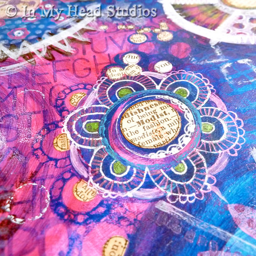
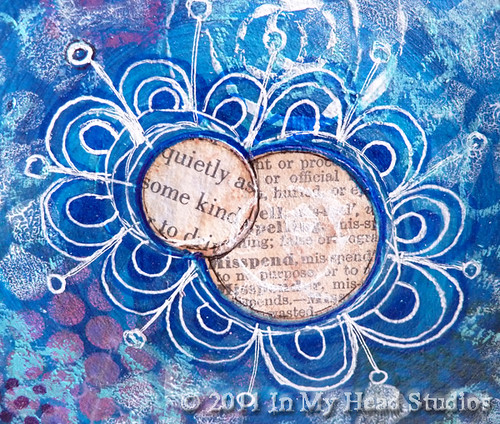
This is a close up of a flower created with gel pens and circles punched from an old dictionary page. I really like the lettering in the background on the left. That was done with a Copic marker and a stencil. The colors compliment wonderfully.

Blue & Magenta Circles :: Detail

This is a mix of a little bit of everything: paint, colored pencil, gel pen, book page, and pigment ink.

Blue & Magenta Circles :: Text Circles Detail

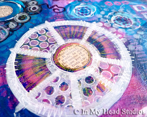
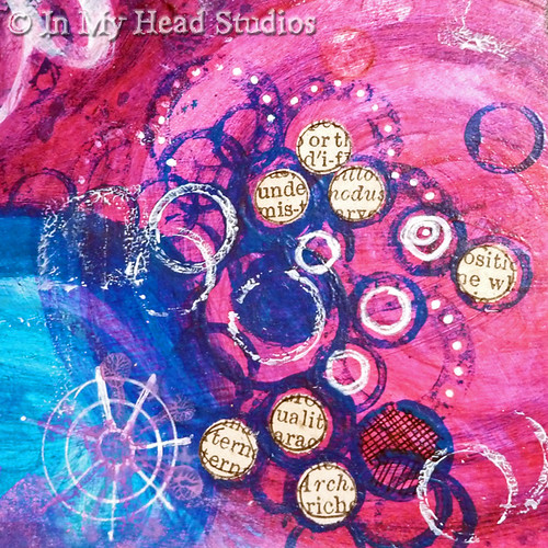
Circles stamped with found objects. The 1/4" hole punch dots fit in the circles perfectly! There's a little gel pen, too.

Blue & Magenta Circles :: Flower Detail

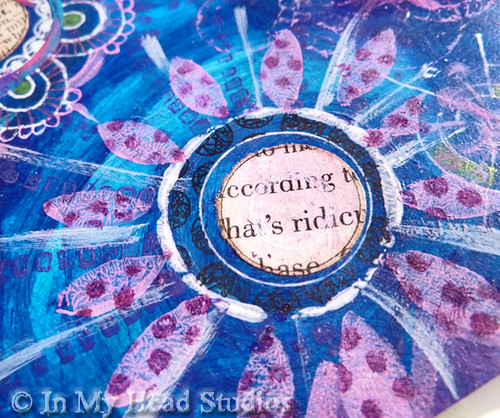
More book page and gel pen. The flower petals and the very small dashed lines are stamped with stamps I made. The tiny dots were done with a stencil I made with my 1/8" hole punch.

Blue & Magenta Circles :: Text Flower Detail

I aged these book pages more than the others with Distress Inks. I like how they are layered. The depth in the background was created with two colors of Copic markers. You can see oil pastel on the edges of this photo. Welcome back, oil pastel!

Blue & Magenta Circles :: Text Dot Detail

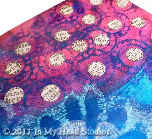
More tiny text dots. More found object stamp circles. This found object stamp came from a disassembled adhesive tape runner. (Nothing is safe from being taken apart and inked or painted in my house!)

Do you see what I mean that each of these close-ups could be their own painting? I must explore this further.

The details: acrylic paint (Golden heavy body and the craft kind), matte medium, oil pastel, vintage book pages, gel pen, Copic marker, Sharpie, colored pencil, pigment ink, stencils. On paper. 8.5” x 11”

So now I am back to the painting board to make some simpler pages for chopping up!

Happy Middle Of The Week!


- Vickie

Sunday, January 24, 2010

NEW! This Time of Year: Artist Cards, Editions & Originals

New in my Etsy shop! It's an Artist Card, Edition & Original (ACEO)! Isn't she a cutie-pie?!

This ACEO is an original, mixed media collage. It is made with paper, vintage lace, digital photos, machine sewing, a hand painted background, and text from a vintage book. The crown and wings have sparkly glitter on them. The card measures 2.5 inches by 3.5 inches - about the size of a baseball card.

This is one of one (1/1) in this set. You are getting an original, one of a kind ACEO. Signed by the artist, Victoria Porter (me!), on the back and dated 1/15/10. It will be shipped via USPS First Class in a protective sleeve with hard backing to prevent bending. The copyright symbols and letters do not appear on the actual card.


ACEOs are a fun and affordable way to collect art from your favorite artists. They are suitable for framing and make great gifts!

I'll be coming out with many more so stay tuned! I love making these!

I can make custom fairies from digital photos of your little sweeties if you like. Shoot me an an email at inmyheadstudios {at} gmail.com.

Tuesday, January 5, 2010

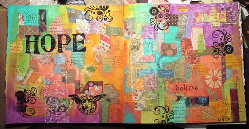
Hope: Art Journal Page

Hope :: Art Journal Page

I did it! I got into working in my new handmade (by Parkside Harmony) art journal! Success! The paper quality is most excellent. No wrinkling or buckling. The pages are Stonehenge heavy weight paper - some of my all-time favorite paper! It is good for just about any medium.

Most of yesterday was spent creating this page. I didn’t really plan much where the different papers were going to go. I just went with what I picked up at the time. I used matte gel medium to glue the paper down and went over it to seal it. I like to go back and fill in the blank areas with paint. The gel medium makes for a nice painting surface. It is also good for stamping on with paint or ink. Adds a lot of dimension.

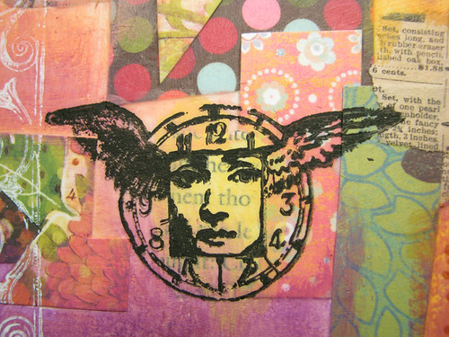
Hope :: Art Journal Page :: Close 1
Click on images to see in my flickr stream.

The book pages measure 8” x 8” so this spread is 8” x 16”. I liked working across the fold of the binding. I have been working in spiral bound books and it’s harder to do that in those.

I thought the theme of “Hope” would be a good way to start my 2010 art journal. My plan is to complete the whole book by the end of the year. Ideally, I would like to then exhibit the book somewhere. But first things first… make more pages!

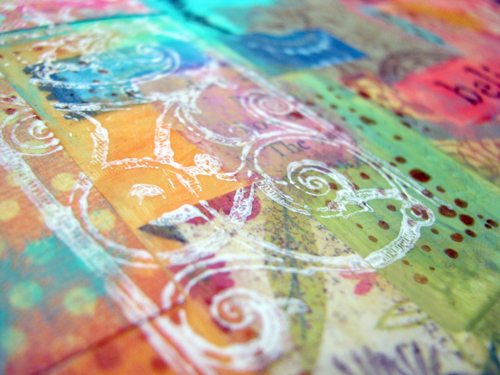
Hope :: Art Journal Page :: Close 2

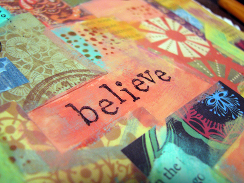
Hope :: Art Journal Page :: Close 3

I took a lot of photos of the page so I can print out artist trading card sized images and use them for “instant” backgrounds. Why not make all this work go a long way? I multi-task… so should my art!

ShareThis