I spent yesterday playing in my art journal.
This is still on my work table today because I cannot decide what else it needs. Maybe someone dancing among the stars? Or someone hanging around on a moon?
It started in a totally different color scheme. I had not played with Tim Holtz's tissue paper on the roll yet. It's not as absorbent as I was expecting - being tissue paper and all. Water and ink practically beaded up on the surface. The many pieces of crumpled tissue in the background began as a rainbow of colors adhered to the page with matte medium.
It wasn't pretty! It got "muddy" looking after a while.
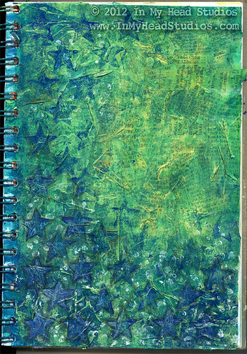
So I painted over it with phthalo blue (green shade) fluid acrylic, phthalo green (blue shade) fluid acrylic, and some yellow craft paint. I made the paint more translucent with matte medium and some GAC 100. This works better for me than just thinning them with water.
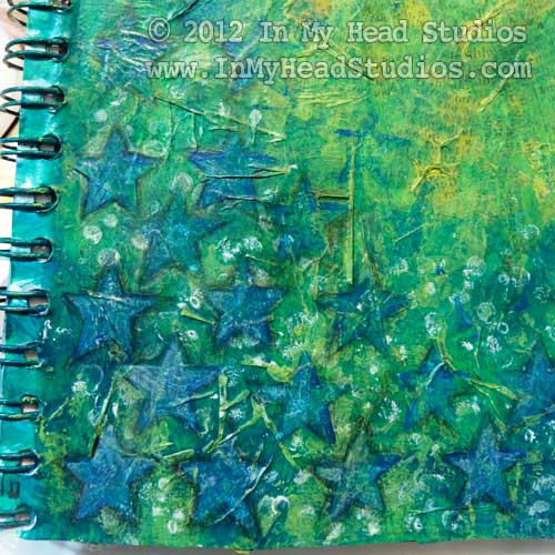

So I painted over it with phthalo blue (green shade) fluid acrylic, phthalo green (blue shade) fluid acrylic, and some yellow craft paint. I made the paint more translucent with matte medium and some GAC 100. This works better for me than just thinning them with water.

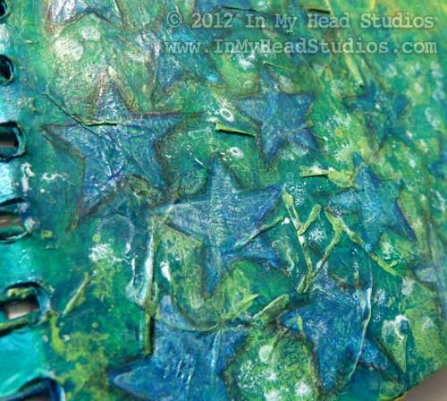
This star stamp is one I created with fun foam and cardboard. These were stamped with a thinner glaze layer of paint.
I've noticed in some artists' work that I love there is often a bit of shading around elements in the image to blend them in. I had to play around with a few different media to duplicate this effect. First, I tried a water soluble graphite. It was too gray and shiny like pencil marks - not black. So I busted out the good Conté pencils and used the pierre noire B grade pencil. The B made a nicer blending mark than the H did. After I traced around the stars I blended the marks with a paper blending stub. I like how it worked out and plan to use this more often.
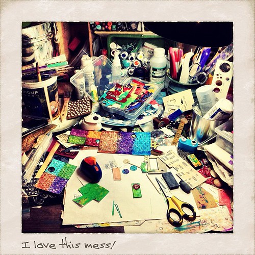
What's on your work table this week?
- Vickie


