To be honest, I'm not completely sure. I really had to go back and almost dissect my work to produce an answer.
Right now my best "guess" is using color theory to not layer colors over each other that produce muddiness (like putting a bright yellow over a purple because red + blue + yellow = mud).
I use rather bright paint colors to begin with. As with any kind of paint the colors vary in opacity and translucency. Knowing your paint helps a lot.
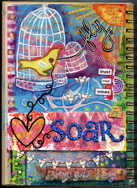
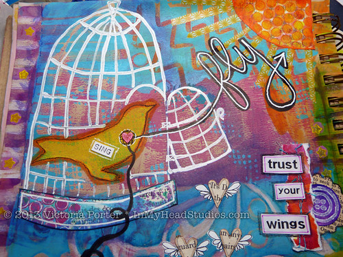
I will freely admit much of this print is a happy accident. This piece was very experimental from the start except for the leafy vine stencil I cut freehand.
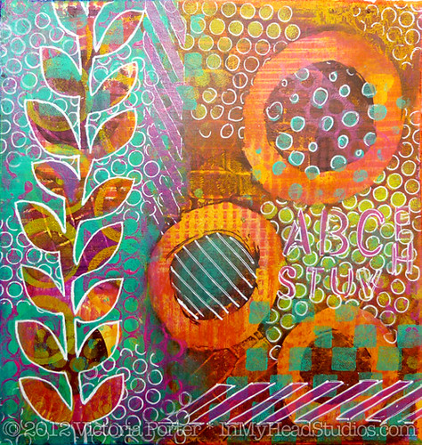
The first layer of paint is a dark cranberry purple - Yes, I know I just ignored the suggestion above about putting those colors in a bottom layer. Experimental, remember?
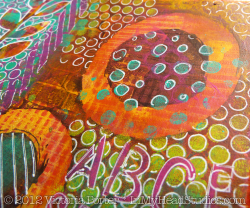
The large circles, when wiped out with my finger and a paper towel, looked really nice with how organic the edges became when printed.
I added a little fuchsia over that cranberry purple. You can see in the wiped out circles the little lines and squares of fuchsia.
I wanted a lot of color and layers under the vine to create a lot of dimension. Intending to just print on the left side under where I planned to put the vine stencil, I inked up my gelli plate with yellow. While printing the left side of the piece, the right edge of the paper fell out of my hand and into the yellow paint. EEEK!
Mud! Instant muddy brown. What to do?! Grab a baby wipe!
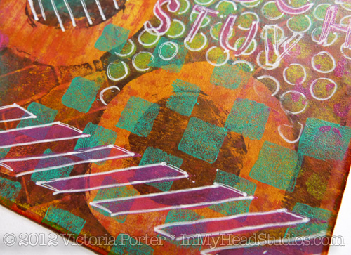
I figured there was enough paint on the paper already that it would hold up to a wet wipe down. When I wiped away the yellow paint it left this glowing, bright yellow orange behind. The fuchsia and yellow created this color in the white space of the wiped out circles. So basically this side of the print received a yellow color wash. Nice happy accident!
Incidentally, you can see how awful that yellow muddied things up if you look in the upper right corner of the piece. There is some of that yellow that I didn't wipe off. (I suppose if I wasn't going for bright colors and wanted brown I would have been satisfied with that yellow.)
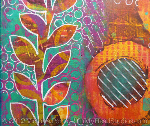
I printed a thick layer of turquoise while masking out the vine with my hand cut stencil. Then I used a handmade stamp over that with more fuchsia. Several more handmade stamps, some stenciling with punchinella, and some white gel pen brought the piece together.
Ta da!
Working on this piece got my brain wondering how color washes over prints would look. I added Distress Stains over some parts of other prints, and it looks really cool. Adds a pop the piece didn't have before. I also seem to have a thing against white space. I love full blown color all over. I made some prints on paper I covered completely in Distress Stains and watercolor.
Color washing first also helps me avoid the "white blank page" staring contest. It's already started! All I'm doing is adding to it, I tell myself reassuringly.
I would love to share in the joy of your happy accidents! Link up to your posts about them in the comments, please!
- Vickie