Wednesday, June 20, 2012

What's On My Worktable? : Wednesday


What's On My Work Table Wednesday

It's Wednesday! Time to peek at my work table for "What's On Your Worktable Wednesday" over at The Stamping Ground blog

Today I am working on another Index-Card-A-Day (ICAD2). I'm going to use the red thread to sew around the house shape - which is my ICAD for today. The postage stamp, bird, and nest will be going on the house. For the buttons, I am still undecided. They sure do look good with the colors in the ICAD. Might have to get them into the design somehow.  

The paper covered spool is part of a gift for my bestie so I cannot say more about it just yet. :)

I just noticed in the photo that you can see the back of my scrap paper - an old unused coupon from my favorite craft store! Seriously folks, I recycle everything. 

Also of interest, the amount of space on my table shown here is pretty much all that is cleared off enough to work in. Hello, Six Inch Square Club

- Vickie

Sunday, June 17, 2012

Happy Father's Day : A Card


We are so blessed to have Mr. M's father in our lives. Father's Day has been hard these past two years since I lost my dad. But Mr. M's dad is such a wonderful guy that I'm grateful for the opportunity to celebrate him! 

Father's Day Card :: from Instagram

Most of the time when I start working on something I really don't have the "Finished Piece" visualized in my head. There may be parts of it or just a color scheme to begin with. For this card I was reaching toward handsome and manly. Mr. M's dad is an outdoorsman and enjoys fishing. So I went with earthy tones and unusual textures. 

I started with a blank piece of ivory cardstock, cut it in half, and folded it to make the card part. Using a foam blending tool I inked the edges of the card with some brown inks. Using two shades adds a lot of dimension and is worth taking the little bit of extra time to do so. 

Next up was my choice of papers. Pretty much went all out brown on this one. Using that large of an area of bold vertical stripes was stepping out of my comfort zone. I like swirly backgrounds. But for a guy simple and stylish is the way to go. I distressed the edges heavily. Even tore some off to make it look really tattered. Then I inked the distressed edges to, once again, add more dimension. 

At this point a plan does need to begin forming. I pulled out a couple scraps of paper and moved them around the face of the card until it looked pleasing, and I could decide where I was going. Eventually I chose a strip of map paper, a dark brown cardstock, paper that looks like burlap, and the sentiment printed from my computer that I designed in a font that looks like tire treads meets tweed meets stenciled lettering. How manly is that?!

Father's Day Card :: Sentiment Detail

I wanted a layered look so I put the strip of map paper between the two mats for the sentiment. That helps tie the elements together. 

When deciding to use my sewing machine on cards I find that if I don't really have a solid plan from here I mess the stitching up. Or sew the card itself shut. (Come on. Don't act like that never happened to you.) 

First I adhered the map strip to the dark brown cardstock with the dark brown behind the map paper. Then I adhered that to the card. Time for the sewing machine! 

Sewing Mr. M's dad's Father's Day card.

I stitched all the way around the card twice and then ran border stitches along the map strip edges. On cards like this where distress is good neatness doesn't count. I wobble the line a bit. It's more interesting. 

I glued the sentiment to the burlap paper and then glued that down over the map strip and stitching. See how planning ahead on the stitching prevented me from sewing through the sentiment? :) 

(Can you tell I'm not a seamstress? 99% of the material put through my sewing machine is paper. I think the only fabric I stitched was my craft show tablecloth hem.)

Father's Day Card :: Button & Map Strip Detail

I love using buttons on cards, and for guys it's especially appropriate. I chose an assortment of brown buttons from my extensive stash. Whenever I use buttons I pretty much always add thread through the holes so it looks like it is stitched to the card. Buttons on my cards without thread look "unfinished" to me. Again since I was going for a distressed look neatness didn't count and I left some straggly threads hanging on. 

I adhered the buttons to the card using Glossy Accents. I did so because it is wicked strong at holding 3D embellishments, and it dries quickly. Regular white craft glue would take hours to dry in that situation. This took 15 minutes. Joy! 

I thought at this point I might be done, but there was this big blankness in the bottom right corner. It looked unbalanced. I had to come up with something to put there. Digging through the piles of paper options on my messy work table I came across a coffee shop cardboard cup sleeve that had been striped down to the corrugated inside part. Texture! And brown! Perfect!

Father's Day Card :: Hero Flag Detail

I'm in love with bunting and banners of any sort right now. I thought this corrugate would make a cute flag. I trimmed it down to size and clipped the end to make points. The edges were inked in a dark brown and a little black. A tiny voice in my head wondered what this would do if I ran it through the sewing machine. Hmmmmm. Tiny Voice, you may have a good idea! 

I tested it on a small bit of scrap corrugate. The heavy flattening power of the sewing machine foot smushed the wavy texture down. But it was usable by bending it back into shape. Then I stitched the one for the card. 

The card still didn't seem finished at this point yet. Hmmmmm. What to do? What to do? 

DYMO! A solid go-to when stuck! I punched out the word "hero" and then used a regular 1/4" hole punch to pop out the letters so they would fit my flag. I glued them on lined up with the stitching. 

I have a thing for using odd numbers of items in my design. "Hero" is four letters. Gah! It had to be balanced out so I added the three hearts. Ahhh. My OCD is calmed.

Father's Day Card :: Bow Detail

The spot where the flag met the seintiment mats looked stark. Another solid go-to for masculine cards is raffia. It's a good, natural material to get away with making a bow not look too foofoo. And, yes, I did ink the raffia a bit to make it look old. Once again, the Glossy Accents is the glue to use for sticking raffia bows to cards.

I'm wishing ALL the daddies out there a very Happy Father's Day!! I don't care how tough and gruff you are. If a two year-old hands you a toy phone, you answer it! :) xoxo

For the rest of you, have a shiny, sparkle filled Sunday!

- Vickie

Saturday, June 16, 2012

Butterfly: Index-Card-A-Day for June 10, 2012


today's index-card-a-day. #icad2

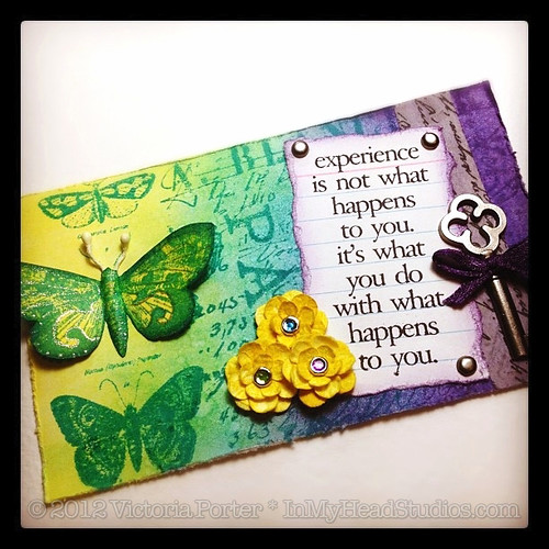
“Experience is not what happens to you. It’s what you do with what happens to you.”

Rochester in the spring is lush lush lush. Flowers, trees, and everything else are blooming and verdant. It’s like the Garden of Eden around here lately complete with budding raspberry bushes right next to my driveway. 

The colors in the Spring 2012 Distress Ink palette were calling to me amidst the yellow, teal, and lavender of my neighbors’ gardens. 

I’ll admit I'm a newbie when it comes to working with Distress Inks. I’m an old-school stamper and still prefer my pigment inks for their brightness and colorfastness. As a mixed media artist I rarely plan which medium will be next in my work, and I often have to plan for something wet – like watery paint, matte medium or Mod Podge – to be spread across all or part of a piece. Using inks that are water-reactive like Distress Inks have only led to heartbreak learning this lesson the hard way. Bleeds. Smears. Oh, and tears.* 

So I’ve shied away from them. However, I must admit that I adore the color palette of the whole line and the amazingly inspiring Tim Holtz. I figure I better learn how to use them properly since I bought several pads. 

So I goofed around with them on my Index-Card-A-Day for June 10th! If I messed it up – it’s JUST an index card (plus hours of work – but, hey, that’s part of the artistic process, right?). 

I started out with the colors Squeezed Lemonade, Peacock Feathers, and Shaded Lilac. Using a foam blending tool I shaded the index card starting with the yellow, then on to the teal, and then the lilac. The yellow and teal blended to make a lovely greenish color. The teal and lilac made a shade of blue like the sky at twilight – an impossible ultramarine blue. The lilac ink wasn’t quite as dark as I wanted so I added some Dusty Concord. 

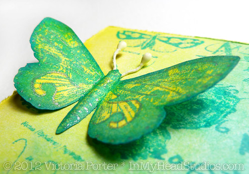
The butterflies were stamped with Peacock Feathers ink to keep the color scheme balanced. I inked the text stamp behind the sentiment with both Peacock Feathers and Shaded Lilac being careful to not get too much ink contamination between the pads. I wanted the text to blend in with the two colors I already laid down. That worked way better than I thought it would. These inks were beginning to score + points at this stage. I even splattered some water on the background to take advantage of the effect that creates. 

Butterfly for ICAD2: June 10th

To make the 3D butterfly I inked part of an index card scrap with Squeezed Lemonade to match the background. Then I stamped the same butterfly in Peacock Feathers and cut it out. Using my extra sparkly gel pen I drew in lines and dots on the wings. Using the foam blending tool I inked the edges of the wings with teal and a bit of the Dusty Concord to give it dimension. I carefully folded the wings up and made the body curve a bit. The antennae are repurposed fake flower middles! 

Key & Sentiment for ICAD2: June 10th

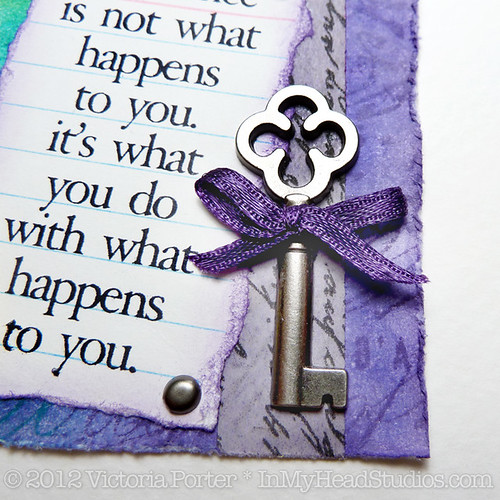
The sentiment is stamped on an index card, as well. How lucky is it that the lines kind of matched up well?! The edges of this were inked with lilac. Next I added brads to anchor this piece. There’s a bit of tissue tape behind the sentiment and under the key embellishment. I tied a little purple ribbon to the key before gluing it down with Glossy Accents. That stuff is amazing as glue. 

Flowers for ICAD2: June 10th

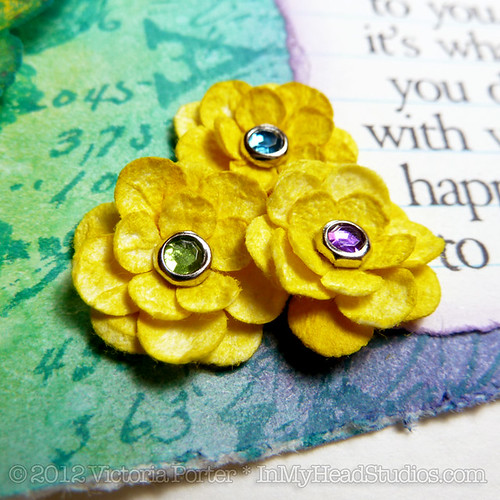
The yellow flowers started as white flowers I bought in a giant glass milk bottle. Again with the foam blending tool I inked them with Squeezed Lemonade to match the card. They are adorned with a sparkly brads and adhered with Glossy Accents. Each flower is made of three flowers. 

For a little more texture I distressed the edges of the whole card. I love how much that adds in such a simple way. 

Distressed Edge for ICAD2: June 10th

I am quite thrilled I took the time to learn more about Distress Inks this way. There’s no learning without some mad scientist experimentation, right? 

Did I know what I was doing? NOT REALLY! That’s why I went ahead and did it anyway! 

I encourage you to go try something new – something you have no idea how to use that has been in your crafty stash for a while. Grab an index card and JUST DO IT! Whether it works out or not I guarantee you will most certainly learn something. 

My mantra: “It’s just paper!” 

* If you happen to know what I could use to put over these Distress Inks so they don't smear or bleed into my next layers of work, I would be very happy to hear it!

- Vickie

Thursday, June 14, 2012

Shopping Trip: Index-Card-A-Day 2012


Yesterday's #icad2: using stuff I got on shopping trip with Mom that day!

My Index-Card-A-Day 2012 for June 11th, chronicles my shopping trip to the craft store with my beloved mom. 

I really just needed ONE white gel pen after mine went missing. So that was the plan when we went into the craft store. I employed the no cart or basket "if I can't carry it in my arms to the checkout then I don't need it" tactic. Otherwise I spend way too much on all the lovely goodies there. I was also hoping to find some embellishments for my travel journal - but not too many. 

I thought my index card for that day should be made with just the supplies I bought that day. I got some Tim Holtz tissue tape, alpha-cards and vial labels, Smash tape, K&Co borders (the tickets), and two white gel pens. The only things on here not purchased that day are the black paper, alpha stamps for the date, ink, and the adhesives used. 

The only white gel pen that's ever worked for me is the Sakura Gelly Roll. I know others swear by the Inkssentials and/or the Uni-ball Signo. Those just frustrate me by not laying down ink and have to be reworked more than I care for.  

The "M" card stands for my mom and the store name Michael's. I tried using most of the lime green part of the tape to tell the story that Mom wore a bright lime green shirt and - as always - matching bright lime green flip flops. That woman owns a pair of matching flip flops for every color shirt she owns, which is on the loooong list of things I love about my mom. 

Also, she actually said "I don't want to hear you lament the loss of your favorite white pen all week. Let's go get one."

She totally GETS me. <3

- Vickie

Monday, June 11, 2012

My Travel Art Kit


Since I went on a trip recently, I brought my art supplies. I cannot be without them for a whole week away!


This is what the kit looks like. It's a plastic container that has three levels that snap together plus a lid with a handy handle. It measures 10" long, 6.5" wide, and 6.5" tall. 

You won't believe how much you can cram into one of these things! It's small enough to fit in my suitcase with no problem. It's light enough (even though it's full) to carry anywhere. You can add layers to it ad infinitum. I've seen my craft show pals pack up in one of these stacks almost four feet tall!


This is what I have packed in each of the three layers. 


The top layer has smaller items as it is a bit shallow. I have my scissors, pens, glue, adhesive, templates, waterbrushes, post-it flags, a tiny tripod, string, stylus, Mini Mister, erasers, pencils, and my loupe. I do not travel with any water in the brushes or mister. They will leak. 


This layer is thick enough to hold a full set of colored Sharpies, a travel watercolor kit, tons of pens, colored pencils, a tin of watercolor crayons, some stencils, and a pack of watercolor paper postcards. 


Here we have an assortment of stuff: scrappy paper on the bottom, washi tapes, pencil sharpener, mini stapler, white out tape, alphabet stamp set, small set of pigment ink pads, date stamp, journal tags, stencils, jotter notebook, an envelope to hold all my travel ephemera to bring home, and tiny index cards. The paint palette is a package from Tim Holtz's gears. This plastic makes great watercolor palettes. I filled them up with the good tube watercolor paint before I left and let that dry. Just wet to reconstitute! They work great and don't take up much space at all. 


I hope you enjoyed this peek into my luggage! :)

- Vickie

Sunday, June 10, 2012

Challenge! Index-Card-A-Day 2012


be brave and shine

I am jumping into the water over at DaisyYellow for the 2012 Index-Card-A-Day Challenge! What am I talking about? Here are the details!
The 2012 Index-Card-A-Day challenge runs June 1 to July 31, 2012. Make something on an index card every day for 61 days. If you start after June 1st you do not need to catch up, really, truly, seriously, just start. This is not a fancy schmancy challenge. You don't have to be on twitter or flickr or facebook or have a blog. Just index cards!

61 days, you say? That sounded like quite the commitment... until I realized...

It doesn't have to be the Mona Lisa every day for 61 days!  
Just do something!

Well, that sounds better. All I have to do is SOMETHING. Particularly a 3" x 5" something on an index card - because that's the size I have handy. And, since I am working on practicing more kindness towards myself, there will be no beating up of my self-esteem if I miss a day. (Got that, brain? I'm talking to you.)

I can always catch back up. After all, this is a CHALLENGE! So, yeah, it's sort of going to be a challenge for me to spit out something everyday - especially on days where I can't even lift my own head. 

Plus I am starting late due to my vacation and I absolutely do not feel the need to try to catch up on 7 cards unless the mood strikes me. And that's OK! 

The card pictured above is my card for yesterday - Saturday, June 9, 2012. It was created with watercolor, colored pencils, inks, stamps, stencils, and a bit of gel pen. I like the colors on this one. It had me craving mango smoothies later that night! 
   
First Index-Card-A-Day!

My Index-Card-A-Day 2012 for June 8, 2012. Created with watercolor, Pitt pens, and Copic marker. I intended to keep this one simple to start with, but the juicy watercolors were calling me and I painted this with a small waterbrush. Now I am glad I took the extra time on it.  

An amazing number of folks are getting involved! Check out the flickr group

I hope you will join us! Get your friends and family involved - even if it's for just one card. You will most certainly have a fun time with them making art!

I am now off for a lazy Sunday with Mr. M and hopefully more mango smoothies!


- Vickie

Friday, June 8, 2012

Vacation!


Just returned from a week away in Georgia. My cousin got married! It was a much needed trip away from home. Mr. M and I had a lot of fun at the lake, seeing my brother, and just hanging out with each other not having a care in the world.

The weather was good. The wedding was beautiful. My niece and nephew are getting big! The lake is still my favorite place in the world. I didn't bring home a fabulous vacation sun tan, but I definitely brought home some new freckles. 

Upon our return, my luggage wasn't on the carousel. It was listed as on the plane, but was gone. I was sad about my missing charm bracelet, but realized I could replace almost everything in about an hour at the mall and the art store. Yep, my travel art kit was in there! Gah! We left the airport not knowing what happened to my luggage.

Schrödinger's Luggage: There is a cat in my bag. It's either dead or alive, but we will never know...  because I'll never see my luggage again!

Turns out someone accidentally brought it home with them rather than their own bag. I would pay to have seen their face when they opened my bag! "This isn't MY stuff!" 

Thankfully, the airport called a few hours later to say that someone returned my bag. He added that he didn't see how a mix-up occured. Their bags looked nothing like mine! A few hours later my bag was delivered to my door. All was intact inside. Nothing missing. Yippee! 

I saved all the bits of paper and ephemera from the trip and the wedding to make a little travel art journal. I'm happy to report we had so much of the lake to enjoy that I didn't get to much art. That's ok. I can do art at home. There's no dock here to while away hours. I have my priorities. 


- Vickie

ShareThis